Fall Real Estate Website
UX Workshop, UI/UX Design, Dev handover
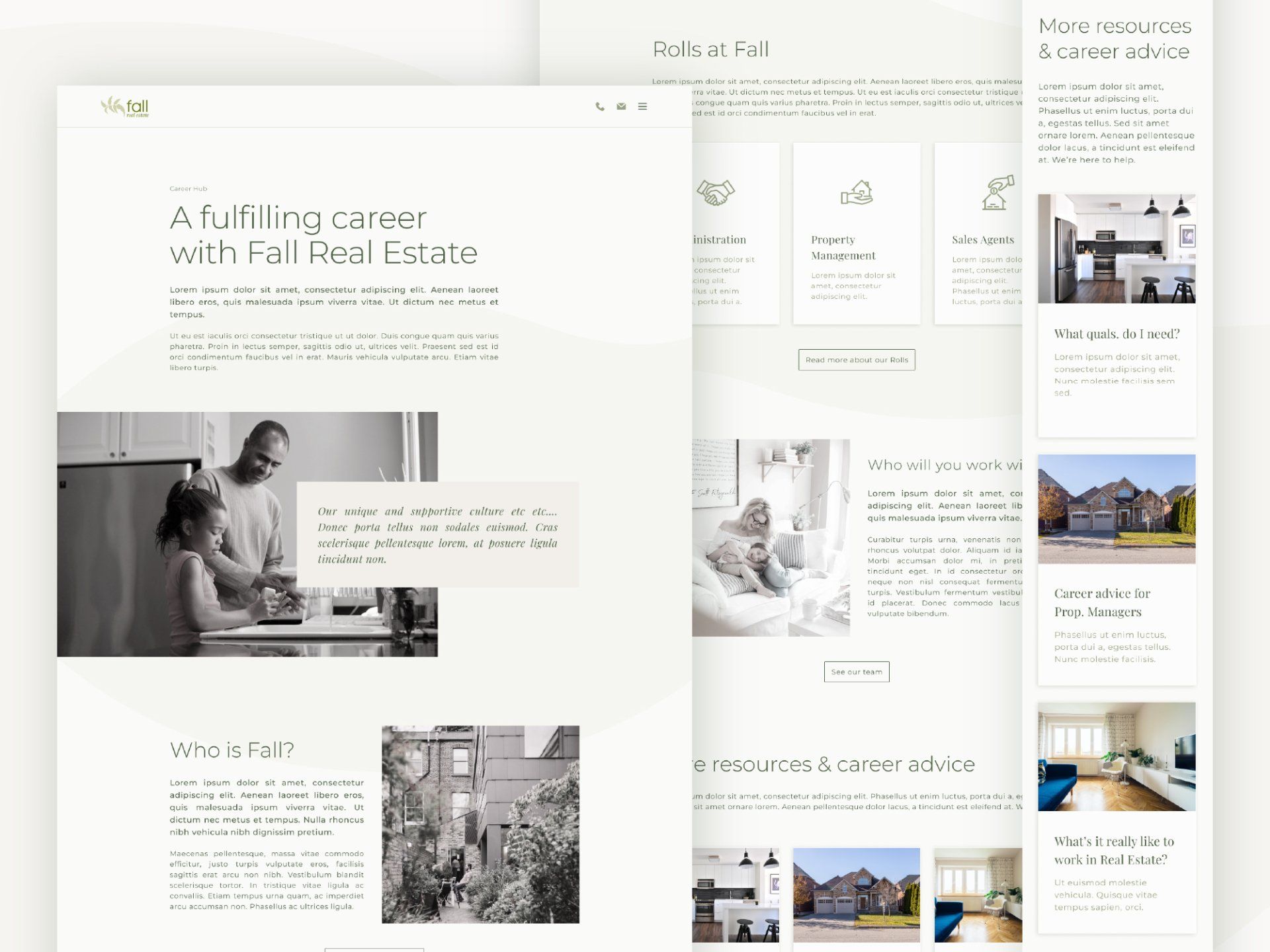
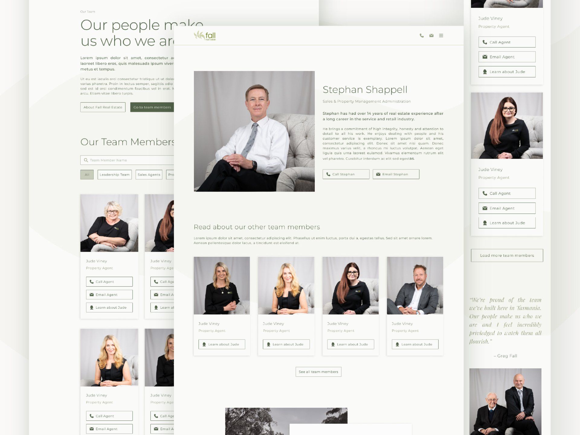
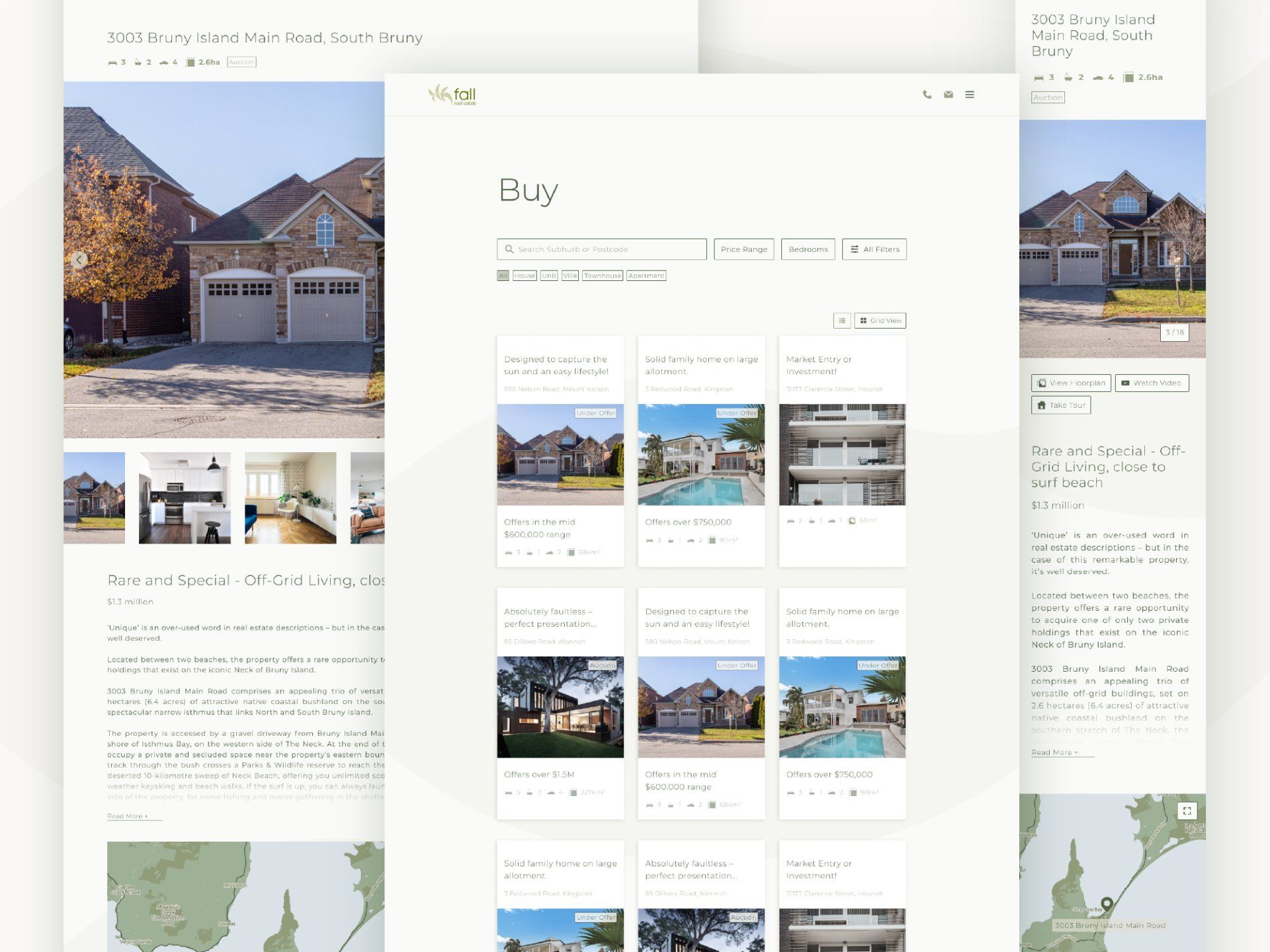
Fall Real Estate is a family owned and operated real estate business based in Southern Tasmania. We worked together to redesign their website, so that it enhanced their customers' experience and aligned more closely with their marketing strategy.
I guided the Fall team through UX workshops in order to tease out their site objectives. Working in this collaborative manner meant that we were all on the same page throughout the entire design process. It also allowed for everyone's voices to be heard and listened to.
From there we deep dived into each user type and identified their individual needs, building strategy around how they would move through the site and putting ourselves in their shoes, to pre-empt their wants and needs. We also made sure our choices were backed by user statistics and that the new site would be designed for marketing success from the get-go.
The Fall site is large, with lots of information and multiple user types. It was important for the look of the site to almost sit quietly in the background, in order to support the many users through their journey and not to get in their way. As a result, the final design is minimalist, sophisticated, clean and modern. It supports the users need to navigate to the things they're after quickly, whilst allowing them to take their time, educate themselves and to engage with Fall.
“We have worked closely with Abbie over the period of 12 months, and in that time she has been extremely professional, accommodating and very patient with us which has resulted in a beautiful bespoke design that encompasses all of our different wants and needs. She really investigated what our company was about and what we wanted to achieve and turned it into a product we are really proud of. Abbie has the ability to know exactly what we want before we know ourselves, and is constantly coming up with innovative ways to set us apart from our competitors.
Abbie always delivers quality work on time and is very open, friendly and honest while maintaining a very professional service. We would not hesitate to recommend her to anyone who is looking to upgrade their brand awareness in the digital world and we look forward to working with her again.”
Greg & The Team, Fall Real Estate
Other projects
Here's a handful of other projects I've worked on with my clients.
FLAX Brand & Website
A unique and elegant brand and website for a bespoke accommodation stay.
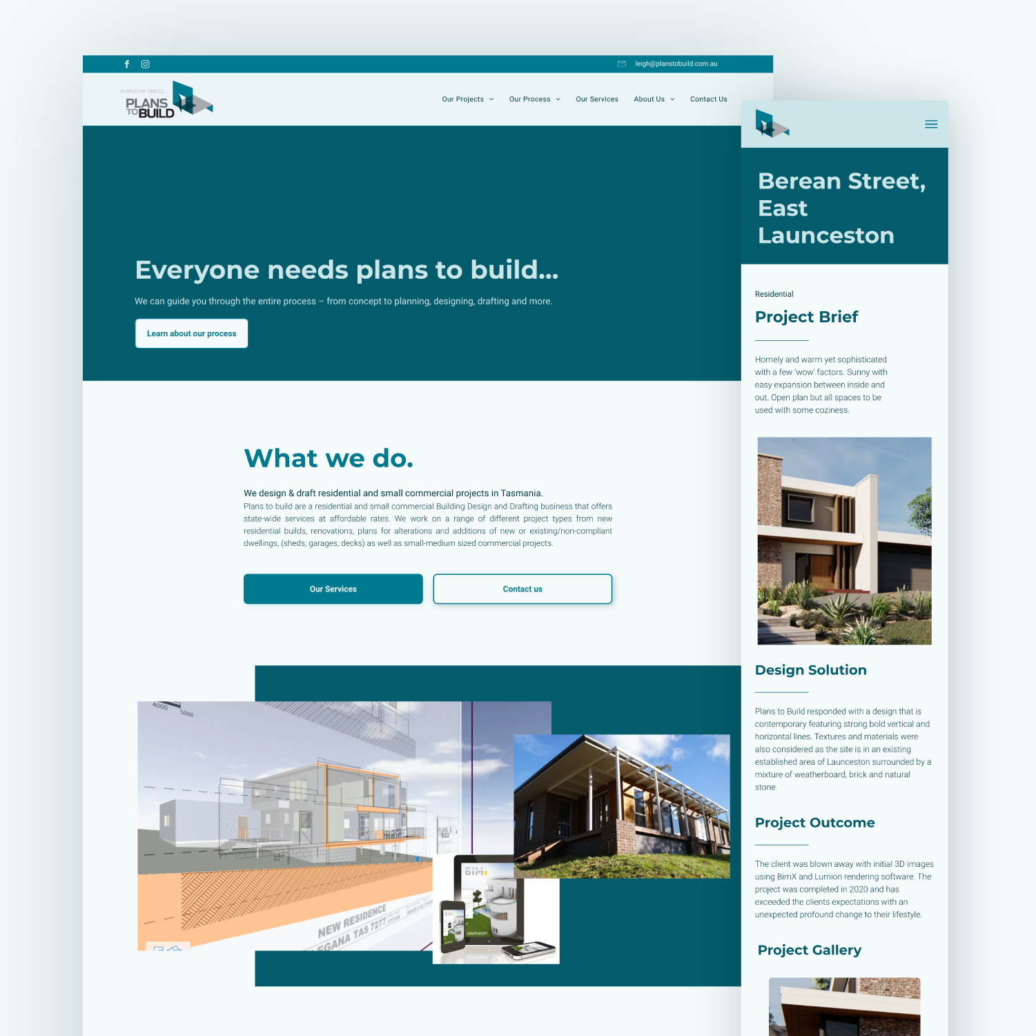
Plans to Build Website
Plans to Build website’s primary purpose is educate current and new clients.
Red Salon Brand
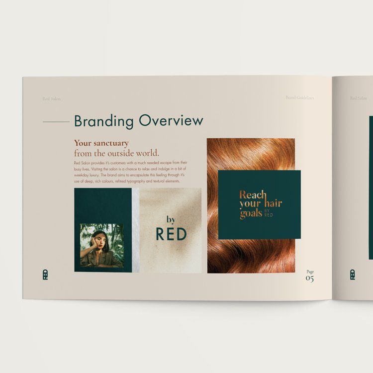
Red Salon were after a complete brand and logo refresh, which reflects their business and clientele.
Typesetting
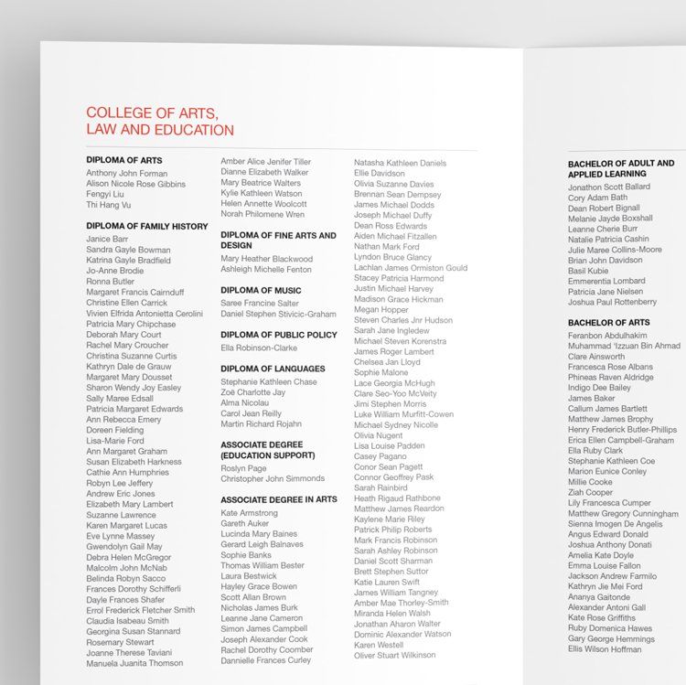
I love typesetting. It's highly detailed, often time sensitive work which feeds the soul of my inner type-nerd.
Are you curious?
Do you have an idea you'd like to explore? Flick me a message and let's get talking!
Abbie-Rose Design acknowledges the Traditional Custodians of Australia and their Elders past, present and emerging. I pay my respects to the traditional thinkers, creators, owners and community of the island of lutruwita, on which I live and work.
All Rights Reserved | Privacy Policy | Abbie-Rose Design | Zines

